I thought I’d take a minute to explain how to read the river graphs that Alberta Environment produces, and take a look at the difference between a dam-controlled river and a natural one.
Let’s start by looking at a natural river, the Hay River. The blue line is this year’s measurements, and the historical values are indicated by the dotted lines, with the fine red line being the historical average:

Look at the historical values. You can see the peak of spring run-off quite clearly, and the whole graph has a certain “downhill slant,” doesn’t it? Now, let’s try the Chinchaga, another natural river:

Again, there seems to be a peak showing spring run-off, with a gradual decrease throughout the year. The blue line almost looks like handwriting, written with a left-leaning slant. This is the way it should look — rain showers cause peaks and then the water flow gradually decreases.
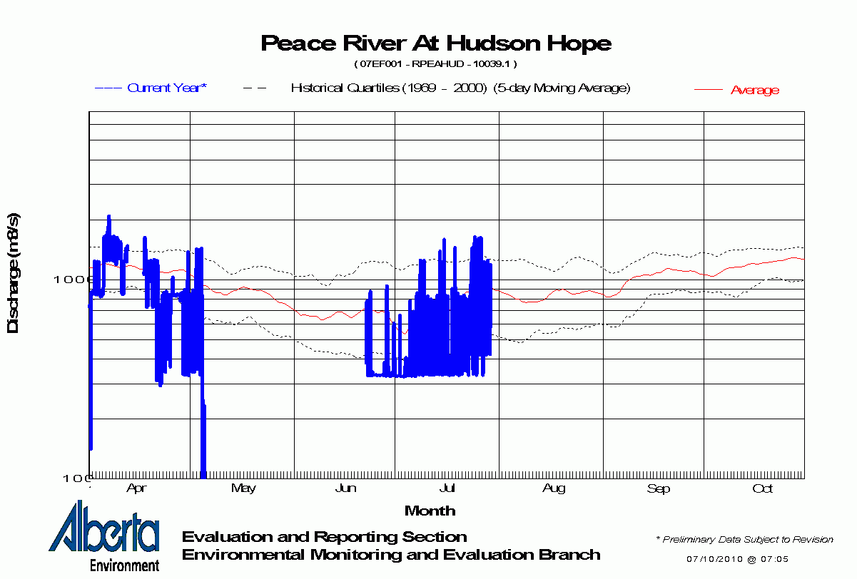
Now let’s look at the Peace River, controlled by two dams (but really, just the second one, the Peace Canyon Dam). Hudson’s Hope, the monitoring station closest to the dam, looks like this:

The first big difference you’ll notice is the blue line, the annual data (this one is from last year, because this year’s graph has a lot of gaps in it). It goes up and down like crazy, doesn’t it? Well, that’s exactly what the water level near Hudson’s Hope does. The dam HUGELY affects the amount of water flowing downstream, and when it releases extra water due to additional electricity demand, it shows. The water level can easily go up 3 or 4 feet overnight (or in any short period). Some of those variations are 420-1050 cubic metres of water per second — 2.5 times the volume (for example, from August 2-5)! This graph is on a logarithmic (log) scale, so notice how the lines are closer together below 1000, which can make the variation appear smaller. Log graphs are used when there is a large variation in the data being displayed (no kidding).
But let’s not forget to look at the historical figures. They don’t look quite right, do they? There is no peak spring run-off — instead, the water level decreases when it is supposed to increase (May-June). We don’t even see a peak for all that snow in the mountains melting! That’s because it’s all captured in Williston Reservoir and held back for controlled release by the dams. This confirms what I noticed while paddling. The shores didn’t look as they should. They don’t have a gradual muddy cliff-bank, with lots of horizontal layering. Compare these two photos:
 [/caption]
Shores near Taylor, not showing muddy bank or layering along shore
Let’s look a few more graphs for the Peace River. Here’s Taylor, BC, almost 100 km downstream:

Still a lot of unnatural variation in the annual data, but is that a small peak I see near the beginning of June? Perhaps; the water level is now affected by the dams PLUS a couple of rivers, the Halfway River and the Pine (depending on exactly where the monitoring station is — I don’t remember seeing it). Let’s go a little farther, to the town of Peace River (375 km downstream):

Looks similar to the Taylor graph, doesn’t it? Except now the blue line has less-radical variations — the river has had some time to even out the effect of those huge water releases. Also notice that the overall volume has gone up quite a bit — above 1000 — whereas at Hudson’s Hope, it was generally below 1000. That’s because several rivers and a hundred creeks have added their water to the Peace by now. But, still no spring run-off peak in the historical data.
Let’s look at one more, the farthest point that is monitored, Peace Point, approx 1115 km downstream of Hudson’s Hope:

This is the closest the Peace River comes to looking like a natural river, and the shape of the historical curve still isn’t right. It’s interesting to note that the data used for the historical quantities starts in 1967, one year before the Bennett dam opened. I guess they thought they should monitor the river level, which is good in terms of trying to understand the effects of the dam(s), but they didn’t start enough years ahead to get a pre-dam historical baseline, to see what the spring runoff was really like. Many environmentalists believe that the Peace-Athabasca delta, a Ramsar site of International importance, is suffering because without that mighty inflow of water once a year, some areas of the delta do not receive the water they need. If we extrapolated what the Hay River spring run-off peak looks like and imagined it on the Peace River graph, it would reach discharge levels of almost 10,000 (at least 8,000, I’d estimate).
I know there is some debate about how the dams affect the Peace-Athabasca Delta, and if you read the wikipedia page, it doesn’t sound like there’s any problem. Just remember what wikipedia is: an open document. Anyone can edit what he/she sees there. It can be slanted by opinion and altered by those with an agenda. I’m not saying it isn’t great! Just that it isn’t always, necessarily, 100% true.